I decided to revisit Audacity now that I know I can do noise reduction in the application. I think it works relatively well, but not as well as I would have hoped. I think my level of expertise with Audacity has remained the same. The first audio clip is the original of me talking in front of the fan and the second is the one with noise reduction applied.
Eleventh Week
How would you feel about helping someone else learn how to use it? What are the benefits and limitations of this tool? What sort of accessibility concerns should you consider with this tool? Look at the StoryMap examples provided below. From what you can see, what makes a good StoryMaps? What is something to avoid?
Learning to use ArcGIS StoryMaps was much easier than I expected. The interface is intuitive, and it felt a bit like building a slideshow with interactive maps mixed in. I’d feel comfortable helping someone else get started, since it doesn’t require anything technical to make something that looks polished.
One of the biggest strengths of StoryMaps is how it combines narrative and location—it’s perfect for telling stories tied to place. That said, it has limitations. Without proper alt text or clear organization, users relying on screen readers might struggle.
From examples like Segregation is Killing Us and The Voices of Grand Canyon, what stood out was clarity and flow. They used maps and visuals to support the story rather than distract from it. On the flip side, How to Make an Awful StoryMap showed how clutter, inconsistency, and poor pacing can ruin the experience.
Tenth Week Reflection
How would you feel about helping someone else learn how to use it? What did you find most interesting? What did you find most frustrating? What questions do you still have, and what parts of the tool do you want to explore more deeply?
I would be happy to help someone try to use it. I think the UI is less overwhelming than I expected so it looks easy to navigate. However, I wish I could turn on dark mode. When I searched it up online, it says I have to go to Edit > Preferences, but there was no Preferences under Edit. Perhaps there is another way to turn on dark mode, but clearly it is not easily accessible. Also, it is frustrating that whenever I press command + tab to switch to another window from Audacity, it “switches” to Audacity. Even when I click on another window, it “switches” to Audacity. I really wonder why that happens. Maybe it is not built to be very compatible for Mac? I would like to explore if Audacity can automatically remove static/mouth noises/background audio from the audio.
Ninth Week Reflection
How would you feel about helping someone else learn how to use Gale Digital Scholar Lab? What did you find most interesting? What did you find most frustrating? What questions do you still have, and what parts of the tool do you want to explore more deeply?
What are some of the steps that the student researchers have to take? Does seeing other student’s work change your view of the tool or of text analysis, and does it change your confidence in your ability to use the tool?
I think it’s very interesting that it’s able to count the frequency of the words. It reminds me of when I went to a linguistics conference this spring break. They talked about developing a corpus and I wonder if they used this resource to do so. It does take a while for the program to finish analyzing though, which can be frustrating. I would like to explore all the various analysis tools that Gale offers. I think it would be fun helping someone else learn how to use Gale while I myself am still learning it.
Student researchers have to take several important steps: identifying a research question, building a relevant content set, cleaning the data, running different types of analyses, and then interpreting the results in a thoughtful way. The process requires critical thinking at every stage, which I appreciate. Overall, I’m interested in exploring the tool more and seeing how I could apply text analysis methods to topics I care about.
Eighth Week Reflection
What do you think is necessary to create good documentation? What documentation will you and your project lead need to create for your Vivero project – and what steps do you need to take to make this happen?
I think clear instructions and images are necessary to create good documentation. A possible documentation we can make is how to duplicate a page in WordPress. I would need to try to duplicate the page myself and take a bunch of pictures along the way.
Seventh Week Reflection
How would you feel about helping someone else learn how to use it? What did you find most interesting? What did you find most frustrating? What questions do you still have, and what parts of the tool do you want to explore more deeply?
I would be able to help them but because I don’t have that much experience with it, I wouldn’t be particularly confident. The amount of stock videos and animations was interesting. It’s kind of difficult to adjust the length of time that an image appears to a specific time. I wonder how often WeVideo gets updated because it feels old and outdated to use. Overall, I think WeVideo is much less user-friendly than CapCut. The interface feels less intuitive, and I wish Vivero would train students on CapCut instead, as it has a cleaner design and is easier to use. Also, I think CapCut is more widely known—I’ve heard of many people using it, but I had never heard of WeVideo before today.
Sixth Week Reflection (Project Reflection)
Reflect in a blog post in your portfolio site on your project work so far, and on your plans for the rest of the semester after Spring Break (at least 300 words). What have you accomplished? What are your next steps? What issues or obstacles have you encountered that you have resolved or that you are still thinking through? What lingering questions do you have about the project or about your next steps?
As the semester progresses, I’ve been working on developing a website for the 3D Printing Lab, and the process has been both exciting and full of unexpected decisions. Initially, I wanted to build the site using Node.js, which would have given me more flexibility and an opportunity to deepen my backend development skills. However, after discussing with Tierney and Max, I decided to go with WordPress since it has more support, making it easier to maintain in the long run. While I still think I would have had a lot more fun building it from scratch in Node.js, this allows the project to be more sustainable after I leave.
Recently, I gained access to the preexisting Burling Digital Studio WordPress site, which serves as the foundation for the new 3D Printing Lab website. I am still unsure whether we should have a separate subdomain just for the 3D printing information, but that is something I will bring up to Max eventually. Right now, my next steps will be restructuring the site to better fit our needs and incorporating WordPress plugins to allow 3D model viewing and calendar event integration.
I wonder, after I finish updating the Burling Digital Studio website, what my next steps will be. A thought that has been lingering in my mind is I should build the Node.js version anyway—either as a standalone project or as a hybrid solution that integrates with WordPress. A custom admin board could bridge the gap between my original idea and the current approach, offering more control while still keeping WordPress for content management. I still find the idea of Node.js quite exciting, and I think it would be great for developing valuable career skills. Even if it doesn’t become the final solution, experimenting with it would help me better understand backend development and could lead to new ideas for improving the site. Of course, if there are better things I can create or update for Max, I would be happy to do that instead.
Fifth Week Reflection
- How do external map elements like this pop-up influence the viewing experience? How do you think they could or should be used most effectively?
- What choices do you make as map creators that impact the accessibility of your maps for your viewers? What are some concrete examples of accessible features on a web map? What else do you need to keep in mind?
- How would you feel about helping someone else learn how to use ArcGIS Online?
- What did you find most interesting?
- What did you find most frustrating?
- What questions do you still have, and what parts of the tool do you want to explore more deeply?
I think that the pop-ups include a lot of information that can be useful for the user. However, it can get overwhelming. Therefore, I believe it is important for them to be used effectively. I do not know the fine details of how, as I am not yet a seasoned user of ArcGIS.
The choices that impact accessibility of my maps include colors and text content. For instance, using appropriate color contrasts and differentiation is essential for web accessibility.
ArcGIS is very high quality and it was fun to learn how to use! So, I would be excited to help someone else learn how to use it as well. I really like how ArcGIS allows users to visualize spatial data in different ways. The UI organizes information well, and there is no lag. There’s also so many buttons to click and so many adjustments that can be made! ArcGIS offers such rich customizability and I always love platforms that do that. I have nothing to complain about. I wonder how to best integrate ArcGIS Online with other tools or platforms—or how to make it work with real-time data.
Fourth Week Reflection
How would you feel about helping someone else learn how to use Omeka? What did you find most interesting? What did you find most frustrating? What questions do you still have, and what parts of the tool do you want to explore more deeply?
Even though I’m not an expert on Omeka, I would still enjoy helping them use it. I think a big part of learning how to use a tool is exploring how to use it, so I would be learning how to use it alongside them. I think it was interesting how we can add tags. I feel like the UI can get a little annoying. I want the ability to hide parts of the Dublin Core because there are way too many identifiers. I wonder what are other creative uses I can utilize Omeka for.
Third Week Reflection
What types of visualizations were you able to generate in Excel using PivotChart? How could those visualizations shape or impact your understanding of the data? Did you generate any visualizations that were confusing or misleading? Alternatively, did you generate any visualizations that were unexpected or illuminating? Additionally, share a screenshot of one of the Pivot Charts you created, featuring a data variable other than the one shared in the example.
There were all kinds of different visualizations that I could generate using PivotChart. Visualization of data definitely helps people understand data faster and at a glance.
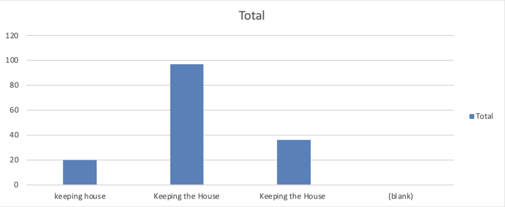
I found it interesting how for the “occupation of female householder” categories, there were only three categories—and all of them were some variation of keeping the house (as seen below). I wonder what “householder” means too—I wasn’t sure if it meant head of household or just a resident.
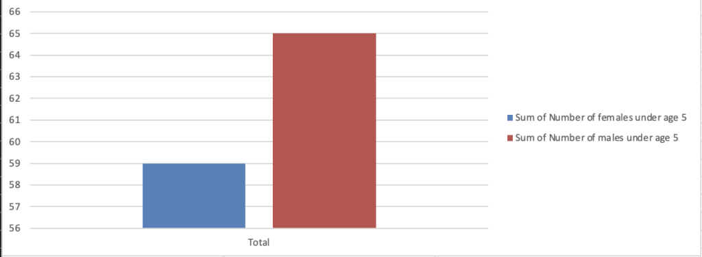
Data visualizations can definitely be misleading if you don’t look at the axis. For example, in the chart below, it seems like there is a huge difference between the number of boys and girls. However, if you look at the axis, you can see it’s not as large as you originally thought.