What types of visualizations were you able to generate in Excel using PivotChart? How could those visualizations shape or impact your understanding of the data? Did you generate any visualizations that were confusing or misleading? Alternatively, did you generate any visualizations that were unexpected or illuminating? Additionally, share a screenshot of one of the Pivot Charts you created, featuring a data variable other than the one shared in the example.
There were all kinds of different visualizations that I could generate using PivotChart. Visualization of data definitely helps people understand data faster and at a glance.
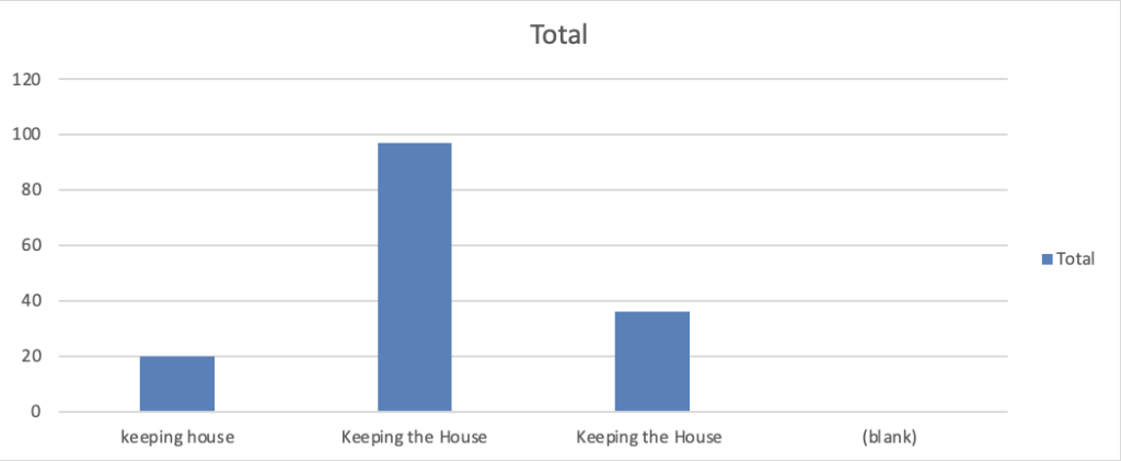
I found it interesting how for the “occupation of female householder” categories, there were only three categories—and all of them were some variation of keeping the house (as seen below). I wonder what “householder” means too—I wasn’t sure if it meant head of household or just a resident.
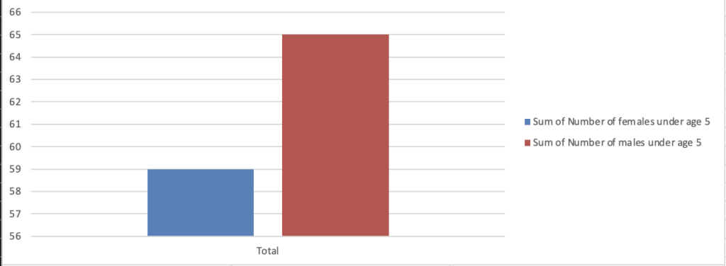
Data visualizations can definitely be misleading if you don’t look at the axis. For example, in the chart below, it seems like there is a huge difference between the number of boys and girls. However, if you look at the axis, you can see it’s not as large as you originally thought.